On 17-19 September, MapAction held it’s largest annual training event, a realistic simulation of a humanitarian emergency, with colleagues from partners including the British Red Cross, Insecurity Insight, Save the Children and Tearfund.
This exercise provides an opportunity for MapAction team volunteers and staff to hone skills, share learning, test protocols and embed new systems and technologies in a challenging but safe environment. It’s also a chance to catch up with friends and strengthen team relationships. Due to COVID-19, this is the first major training exercise of this kind we have held since June 2019, so it was great to be back in the thick of it again.
When MapAction triggers an emergency response, the first step is for a team of staff and volunteers to begin what is known as a “data scramble”. This is the process of gathering, organising, checking, and preparing the data required to make the first core maps that emergency response teams will need, which will also be used as the basis for subsequent situational mapping.
Traditionally, the aim was to complete this data collection as quickly as possible, to get as much data as possible that was relevant to the emergency. However, due to the time-sensitive nature of this work, the team is often unable to dissect in detail the different data source options, processes, and decisions involved as they ready the data for ingestion into maps.
What if they weren’t constrained by time during the data scramble? What if they could deconstruct the procedure and examine the data source selection, scrutinise the processing applied to every data type, and explore the ways that these steps could be automated? To answer these questions, the volunteers at MapAction, with support from the German Federal Foreign Office, have been tackling a stepping-stone project leading towards automation, dubbed the “slow data scramble”. We called it this because it is a methodical and meticulous deconstruction of a rapid data scramble as carried out in a sudden-onset emergency.
Data gaps
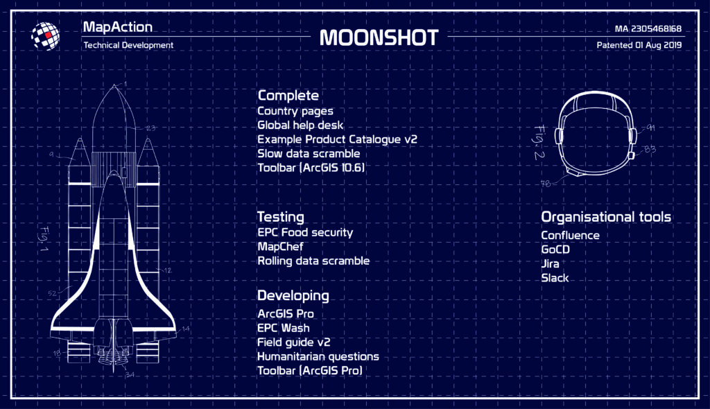
As part of our Moonshot, MapAction is looking to automate the creation of nine core maps that are needed in every response, freeing up vital time for volunteers during an emergency, and, perhaps more importantly, identifying data issues and gaps well before the onset of an emergency. Towards this end, we have just released version 1.1 of our software MapChef, which takes processed data and uses it to automatically create a map. However, even with MapChef up and running, there is still a large gap in our pipeline: how do you get the data in the first place? How do you make sure it’s in the right state to go into the map? And which data do you actually need?
The volunteer team created and led a project intended to answer precisely the above questions, with the goal of scoping out the pipeline. This would include writing the code for completing the above operations, although not yet packaging things together in a smooth way – that is saved for a future pipeline project.
Selecting the right components
The first step was to determine what data is required to produce the core maps. The volunteers identified a list of 23 ingredients that make up these maps, which we call “data requirements”. These range from administrative boundaries to roads, and from airports to hillshading (a technique for creating relief maps). To complicate matters, each data artefact had multiple possible sources. For example, administrative boundaries could come from the Common Operational Datasets (CODs, distributed by the Humanitarian Data Exchange), the Database of Global Administrative Areas (GADM), or geoBoundaries.
“The scale and extent of data available for just a single country administrative area alone is staggering.”
James Wharfe, MapAction volunteer
Next, the team needed to address how to obtain the data and ready it for further processing. Normally, when volunteers make maps by hand, they go to the website associated with each artefact, manually download it, and tweak it by hand until it is ready to be used in a map. However, with the pipeline this all needs to be automated.
To approach this considerable undertaking, the team divided up the work into small, digestible tasks, meeting fortnightly to discuss progress, answer each other’s questions, and assign new tasks. This work continued diligently for seven months, at the end of which they had a functional and documented set of code snippets capable of automatically downloading and transforming the data required for all artefacts.
Overcoming challenges
There were numerous challenges along the way that the team needed to overcome. Understanding the differences between the various data sources proved a significant hurdle. “The scale and extent of data available for just a single country administrative area alone is staggering,” noted volunteer James Wharfe. (Indeed, this data landscape is so complex that it merits its own post – stay tuned for a blog about administrative boundaries as part of our upcoming “Challenges of…” series.)
One particular data source that seemed to crop up everywhere was OpenStreetMap (OSM). Almost all of the data requirements in the slow data scramble are available from OSM, making it a key data source. However, given the sheer detail and size of the OSM database – 1,37 terabytes as of 1 Feb, 2021(source) – there are several difficulties involved when working with the data.
For the download step, the team decided to invoke the Overpass API, and create a Python method to abstract the complex query language down to some simple YAML files with OSM tag lists. Next, the downloaded data needed to be converted from the OSM-specific PBF format to a shapefile, which is the type of data expected by MapChef. Several solutions for this exist: to name a few, Imposm, PyDriosm, Osmosis, OSM Export Tool, and Esy OSM PBF. For this project, we decided to use GDAL, however, we certainly plan on exploring the other options, and hope to eventually host our own planet file.
Code control
Even though the goal of the slow data scramble was not to produce production-quality code, the team still used Git to host their version-controlled code. According to Steve Penson, the volunteer leading the project, “The collaborative and explorative nature of the project meant Git was incredibly useful. With each volunteer tackling significantly different challenges, establishing a strong code control setup made our weekly reviews far easier.”
The team also used the opportunity to extend their Python skills, with a particular focus on GeoPandas, which enables some of the more intricate data transformations that are normally performed by mainstream desktop GIS tools.
Additionally, the group used this work to explore the concept of DAGs, directed acyclical graphs. This term refers to the building blocks of any pipeline: a recipe, or series of steps, that you apply to your data. There are scores of packages available to assist with pipeline development, but to start, the team decided to use a simple workflow management system called Snakemake. Snakemake works by using Makefiles to connect the expected input and output files across multiple pipeline stages. Although, in the end, the team decided it was not the best solution for scaling up to the real pipeline (which is now being developed with Airflow), they agreed that using Snakemake was a great stepping stone to becoming familiar with this key concept.
Working together
Finally, before COVID-19 hit, MapAction’s dedicated volunteers were accustomed to meeting in person once a month – a commitment that led to many enjoyable shared moments and close friendships. This positive and much-loved aspect of being a volunteer at MapAction has unfortunately been hindered by the pandemic. Although still conducted fully remotely, the slow data scramble offered the chance to regularly meet, share expertise, motivate and encourage each other, and work together. Volunteer Dominic Greenslade said it well: “MapAction volunteers are amazing people, and the ability to spend so much time getting to further these friendships was a great bonus”.
MapAction’s Chief Executive Liz Hughes and one of our long-serving volunteers, Alan Mills, have been awarded an OBE and MBE respectively in the Overseas and International Honours List 2021 announced last night. The awards come in recognition for their services to international development and humanitarian crisis operations.
MapAction volunteer Alan Mills becomes an MBE
Alan Mills has been a MapAction volunteer since 2005, applying his knowledge of geospatial systems to help get aid as quickly as possible to people caught up in humanitarian emergencies. He has undertaken many emergency missions including to Beirut for the Syria crisis, hurricanes in Jamaica, the Bahamas and the British Virgin Islands, cyclones in Vanuatu and Fiji, floods in Namibia, Benin, Djibouti and Serbia, the Libyan migrant crisis and Ebola in Mali.
For the past ten years, he has also coordinated MapAction’s preparedness work, helping governments and disaster management teams around the world put in place the skills and technology they need to access essential geographic information in the event of a humanitarian emergency. As well as this, he has helped to run numerous training courses including in the Caribbean, South East Asia, Europe and Nepal and served as a Trustee of the charity from 2012-2018. In his day job, Alan runs his own consultancy business specialised in geospatial systems.
MapAction’s Chief Executive Liz Hughes has been awarded an OBE
Liz joined MapAction as Chief Executive in 2013, after directing humanitarian operations at the Red Cross, Save the Children and Oxfam. She is recognised not only within MapAction but across the humanitarian sector in the UK and globally as a truly inspiring leader. She has helped shape our reputation for technical excellence and value in providing real-time critical information for humanitarian crises and has led us to provide far more than might be expected of a largely volunteer organisation of the size of MapAction. When the Covid-19 crisis prevented operational deployments, at the same time as demand for our services surged to unprecedented levels, she lead the team to rapidly switch our operating model to remote delivery. She is greatly respected by all for her knowledge, clarity of thought and incisiveness and greatly appreciated for her passionate, persuasive and empathetic nature.
MapAction’s Chair of Trustees, Nick Moody, said “Liz has transformed MapAction. Under her inspirational and trusted leadership, the charity has greatly expanded its deployment of geospatial professional volunteers in the face of humanitarian need. She has also grown its technical and operational capability to the extent that the charity could triple its service delivery worldwide during this, the most difficult of years for humanitarian operations. None of this would have been possible however without the dedication and professionalism of volunteers such as Alan.”
Although data science is still a relatively new field, its potential for the humanitarian sector is vast and ever-changing. We caught up with one of MapAction’s Data Scientists Monica Turner to discover how data science is evolving, the impact of COVID-19 on her work and how predictive modelling could see disaster funding being released before a disaster has occurred.
Interview by Karolina Throssell, MapAction Communications Volunteer
How did you get into data science?
I have a background in Astrophysics but wanted to transition into data science, so I started volunteering with 510 global which is part of the Netherlands Red Cross. This was my first experience in the humanitarian sector, and I was immediately hooked. After working briefly as a data scientist at a technology company, I began working at MapAction in March 2020. As part of my work, I am seconded to the Centre for Humanitarian Data in the Hague, which is managed by the United Nations Office for the Coordination of Humanitarian Affairs (OCHA).
What is the role of data science at MapAction?
Even though one of MapAction’s primary products is maps, these are created by combining different data sets. So, while the explicit presence of a data scientist at the organisation is new, MapAction has fundamentally always been doing data science on some level. With this new role, the hope is to both formalise the current data science practices, and expand our analytical capability, ultimately shifting our role from data consumer to having an active role in the development and improvement of humanitarian data sets.
As a data scientist, you often have to wear many hats – from data cleaning to model development to visualisation. With the Moonshot project, we are looking to automate the creation of seven to nine key maps for 20 countries. One of my first tasks is to design and build a pipeline that downloads, transforms, and checks the quality of all the different data sets that make up these key maps. The details of this pipeline will be the subject of a future blog post.
How has COVID-19 impacted on your work?
One of MapAction’s strengths is the field work that we are able to do during an emergency as well as the remote support we provide. However, as COVID-19 has limited the ability to travel, the paradigm has shifted and we need to rethink how we respond to emergencies overall. In particular, we are working to expand the types of products that we offer to our partners, as the demand increases for more remote-oriented products such as web-based dashboards.
At the Centre for Humanitarian data, in collaboration with the Johns Hopkins Applied Physics Laboratory, we’ve been developing a model relating to the spread of COVID, to help low- and middle-income countries plan their responses.
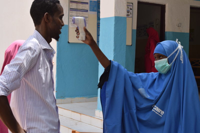
Photo: Trócaire
One of the main challenges of modelling COVID-19 is the novelty of the disease. Since there is no historical data, model validation becomes much more challenging. Additionally, the number of cases and deaths is a crucial input to the model. With higher income countries, more testing is done so the data we need is there, however the availability and quality of this data in low- and middle-income countries poses a further hurdle. Nevertheless, even with these caveats it is still very valuable to provide low- and middle-income countries with a tailored scenario-building tool for developing their COVID response.
Where is data science heading?
Predictive analytics will play a much larger role in the future of data science. The UN is currently working on a huge project to provide funding for predictive models that will enable it to release funding from the Central Emergency Response Fund (CERF), to help communities prepare and protect themselves from disasters before they occur. After a successful pilot project in Bangladesh, we plan to extend our model validation to other types of disasters such as cholera and food insecurity.
At MapAction, the Moonshot will lead a shift towards preparedness and enable us to develop methods to assess the completeness and quality of the data going into our maps. Our hope is that with this emphasis on data analysis, we will be able to provide meaningful contributions to a wide array of humanitarian data sets. Additionally, we are hoping to build an analytics team, and will be recruiting data science volunteers in early 2021, so check our website and sign up to our newsletter to find out how you can apply. And if you can contribute in other ways to our data science work, please contact us!
History will always underscore how landing on the moon represented a significant milestone in the space race, yet what is often less spoken about is the number of technologies that might not have ever made it without space travel.
These include the all-important ability to take pictures on our phone, thanks to the technology originally created by a team at the Jet Propulsion Laboratory, and the technique used to develop diamond-hard coatings for aerospace systems that can now be found on scratch-resistant spectacles. Inventions that originally started life with a bigger purpose but have filtered down into solving some of the challenges in our everyday lives.
This brings us onto MapAction’s own Moonshot initiative – an ambitious programme of work encompassing step changes in the way we use different technologies in the course of our work. This includes things like how we triage, assign and manage the requests for support we receive, and how we can automate certain repeat activities.
One of the first projects we are working on within the Moonshot programme will enable us to produce seven to nine key maps for 20 of the world’s most vulnerable countries automatically, using technology we’re developing that will provide benefits for many years to come. This is being funded through our partnership with the German Federal Foreign Office.
In the humanitarian sector, a perennial challenge is access to high-quality data. This need is even more acute in the chaotic aftermath of a humanitarian emergency, when data and maps are crucial to make rapid sense of the situation and plan the best response to save lives and minimise suffering.
In the early hours of a crisis, one of the first tasks facing our team is to produce standardised ‘core’ maps that will be used throughout the response, regardless of the nature of the emergency. These provide contextual and reference information about, among other things, the local environment, population and infrastructure. Sometimes they are created under difficult on-the-ground conditions or with incomplete information. Once they are in place, they are used to create additional situation-specific maps by layering on top evolving information about the extent and impacts of the emergency and the humanitarian response.
As MapAction has made maps in hundreds of emergencies, it has become apparent that, in creating these foundational core maps, there are many repeatable, generalised tasks that could be handled much more quickly by a machine, achieving in seconds what used to take hours. This would give humanitarian decision-makers the orientation information they need immediately, and free up our specialist volunteers for actively assessing and engaging with the situation at hand and performing the mapping tasks that only humans can do.
Moreover, by shifting the focus from reactive to proactive data sourcing and map production, we can ensure we provide the best maps possible – not just the best maps, given the time and data available and the prevailing circumstances in the midst of a humanitarian emergency.
Many countries, particularly low and middle-income countries, are likely to have data gaps, and they are often also the countries that may have the least resilience to emergencies such as droughts or earthquakes. Identifying and addressing these data gaps in advance is a big part of the Moonshot project, and something that will have benefits for the humanitarian sector as a whole.
Like the proverbial needle in the haystack, important data can exist within a subset of a much larger dataset and accessing it can be tricky. Finding a gap is even more difficult, as you’re looking for an unknown entity that isn’t there. The technology we’re developing for the Moonshot will help us to identify the hard-to-see data gaps and quality issues that currently exist. By discovering these, we can pinpoint what information will be needed to ensure a complete map and then work with partners around the world to proactively put in place missing data or improve what currently exists.
The initial goal of the Moonshot is to publish 180 core maps (nine for each of the 20 vulnerable countries identified at the beginning of the project). The same processes will then be applied to other countries and, eventually, to other types of automated maps beyond these core ones. This means we will ultimately be in a position to expand our understanding and quality assessment processes for more data types. New opportunities and routes of travel are likely to emerge as the project develops.
The ambition is big, but the possibilities that will result from achieving this goal will fundamentally change the way we approach map creation in the humanitarian sector in the future.
In a series of blogs over the next few months, we will share the story of this work as it unfolds, as well as diving down deeper into specific elements of it.
March 9-10 is Holi, an ancient Hindu festival celebrating the arrival of spring with a riot of colour. To mark the occasion I asked the MapAction members for their interesting tips, facts, examples and experiences – anything they felt moved to share – about the use and importance of colour in mapping.
A few people sent me examples of maps they’ve created in which colour was particularly important in communicating and differentiating between different layers of information. Colour can be used to increase the amounts and types of information a map contains without reducing its readability. Divergent colours are often used to differentiate between types of data shown, while sequential colour scales can show degrees of prevalence of a particular feature.
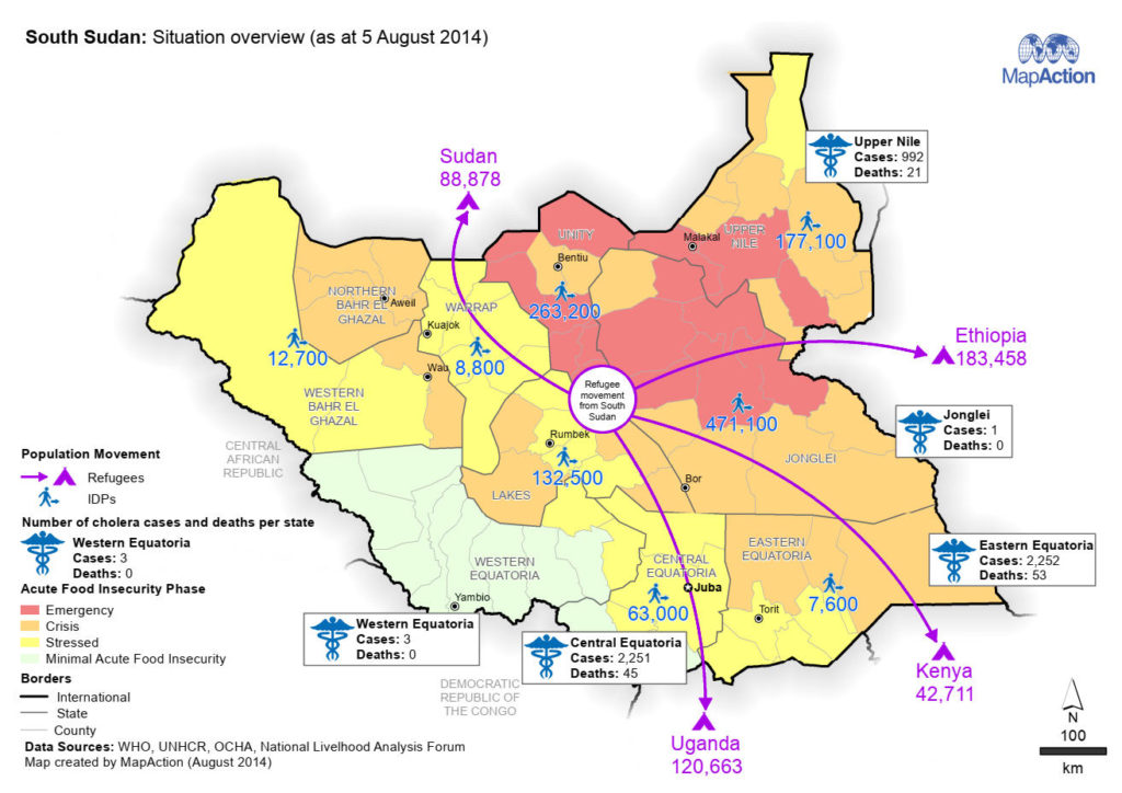
MapAction’s Geospatial Services Coordinator, Matt Sims, shared with me a map of South Sudan he produced in 2014 for our partner ACAPS. He used divergent colours to differentiate between layers of information including data about food security, health and internally displaced people (IDP) movements. At the same time, a sequential colour scale gives an immediate visual indicator of the severity of the food insecurity in each county.
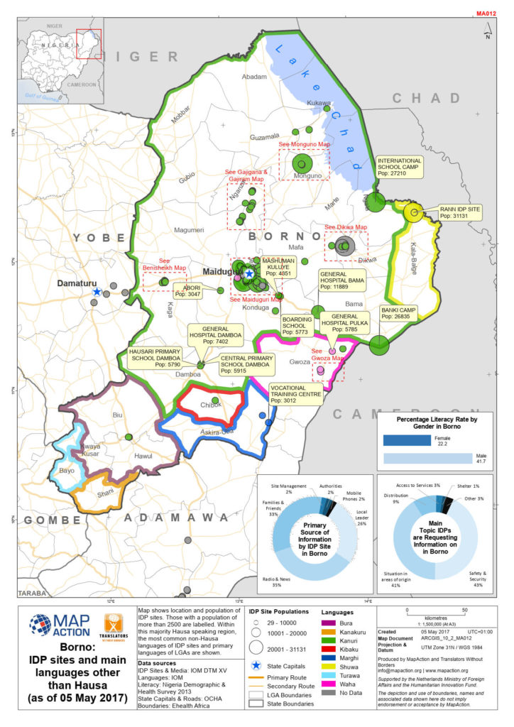
In this colourful 2017 language map of Borno, Eastern Nigeria (below), MapAction volunteer Mark Gillick used divergent colours to show at a glance which groups of IDPs were in locations with a local language other than their own. The map also shows the size and location of each community.
“This is the most colourful MapAction map I’ve made.” MapAction volunteer, Mark Gillick
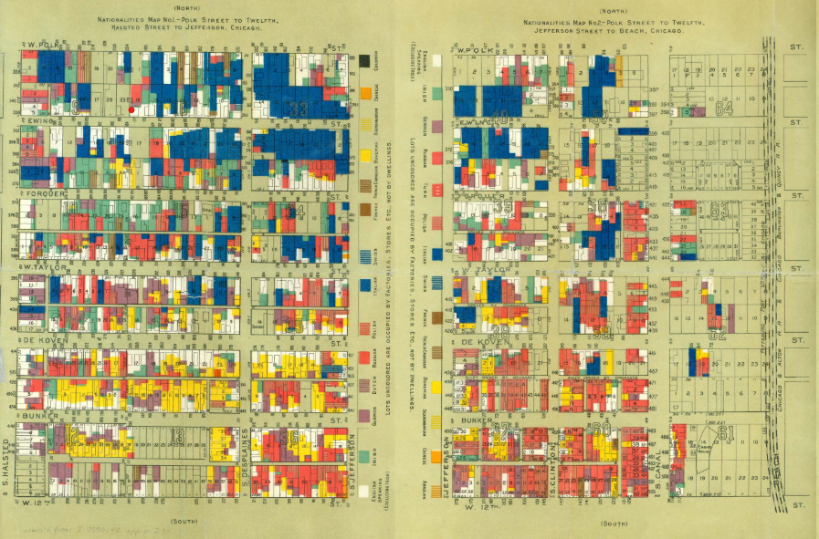
Mark also flagged up the use of divergent colour to enhance communication in the London Underground map and the map below from 1895 of different nationalities in Chicago, USA.
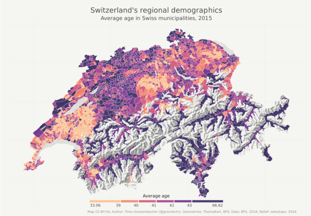
MapAction’s Head of Training and Learning Emma Mumford pointed me to a lovely looking and rather fascinating thematic map of age demographics in Switzerland created by mapping blogger Timo Grossenbacher. The sequential colour scale shows how different age groups are clustered in certain areas. It also demonstrates why yellow is generally taken to be a highlight colour, as the yellow and orange areas stand out against the purples.
Colour considerations and cautions
I had an interesting chat with MapAction volunteer duo Becky and Andy Kervell. As well as flagging up ColorBrewer as a useful mapping resource, they talked me through some of the issues to bear in mind when thinking about colour choices.
Colour blindness – this is quite a common problem. Most people with colour-vision deficiency have difficulty distinguishing between red and green. ‘Red-green’ deficiency affects one in 12 men and one in 200 women globally and can make it hard for them to tell the difference between reds, oranges, yellows, browns and greens. They may also have difficulty distinguishing between shades of purple and may not be able to tell red from black. ‘Blue-yellow’ deficiency – affecting vision of blues, greens and yellows – is another form of colour blindness that is much rarer. This Brilliant Maps blog explores what maps look like to people with colour-vision deficiency.
Format, use and context – colours look different on screen compared to paper, so the ways in which a map is distributed and used should affect colour choice. If a map is intended to be desktop printed, questions around the quality and availability of printers and inks arise. If a colour map is printed in black and white, will it still be fit for purpose? If a map is shown via a projector, will details be visible?
Cultural significances – colours have different meanings and associations in different parts of the world. For example, in some cultures, death is associated with black; in others, with white. Red can be associated with danger, good fortune or grief and death, among other things, depending on where you are. This is one good reason why team diversity, as well as awareness of and consideration for different cultures, is important in mapping – as elsewhere in life.
Another interesting fact I learned in the course of compiling this blog is that mappers use up a lot of blue ink. Because – oceans. According to MapAction’s logistics manager Andy Punter, who looks after all the kit used by our teams on deployment, we get through three or four times as many cyan ink cartridges as any other colour. So, if you ever come across a map with feathering around a land mass to denote the sea instead of a solid block of blue, thriftiness could be the reason.
This is the first in an irregular series of blogs in which we use an international event such as Holi, as an excuse (as if one were needed) to celebrate the diversity of mappers, maps and mapping.
Steve Harper, who works as Charities Director at Hays Macintyre LLP Chartered Accountants, recently joined MapAction’s board as treasurer. Steve acts as auditor and advisor to national and international charities and is co-author of the International Charity Financial Benchmarking Report. He is a qualified chartered accountant with the Institute of Chartered Accountants of Scotland and holds the ICAEW’s Diploma in Charity Accounting.
The nature of our work means that we are only too aware of the impacts of climate change on the lives and livelihoods of the world’s most vulnerable people. Although the causal chain between humanitarian need arising out of climate change and MapAction’s contribution to the problem may not be a straight line, we are, no doubt, a contributor to some degree. And, as an organisation of people with a passionate commitment to improving humanitarian outcomes, it is incumbent on us to take a really serious look at our contribution to the problem.
Towards the end of last year, therefore, an internal working group was created to update our thinking about the environmental impacts we generate during the course of our work, and how we can avoid and mitigate these. In December, the group developed an environmental policy that outlines our commitment to strive for carbon neutrality by 2030. This is both daunting and necessary. In my view, it is absolutely right that we should set such a target. However we don’t yet know the scale of that and what we are going to need to do to tackle it.
Our policy states: “MapAction recognises the devastating effects of climate breakdown and environmental degradation which can lead to displacement, disease, food shortages, water shortages, economic loss, and poverty for people, particularly those in vulnerable regions across the world. Principally MapAction recognises the contributory effect and exacerbation climate breakdown and environmental degradation can have on humanitarian crises. MapAction commits to our own moral and ethical (“do no harm”) responsibility to reduce and minimise our environmental and carbon footprint, whilst supporting those affected by humanitarian crises, supporting Sustainable Development Goal #13 on Climate Action[1] (to take urgent action to combat climate change and its impacts).
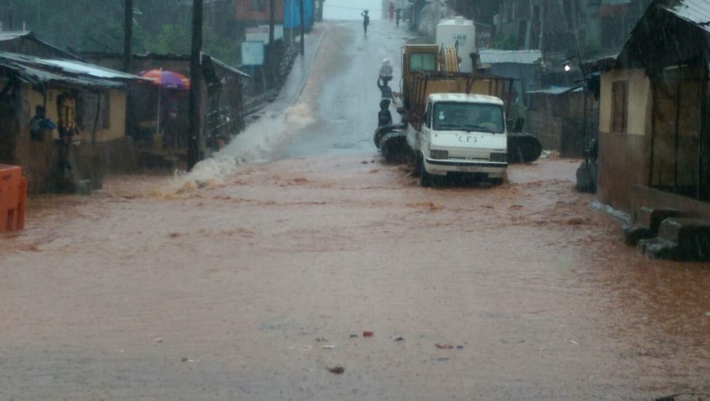
Flooding in Sierra Leone, August 2017
I am very grateful to the working group for developing this policy and taking us forward. There is still quite a lot of work to do to get a clear baseline and some impact measures in place so that, as we embark on this journey, we do so with some clear parameters and actions, and it isn’t just talk.
There’ll be an opportunity for MapAction’s membership to feed in suggestions on what areas we can improve. We will budget and fundraise for this work. We are very grateful for the assistance of Arup, a supportive employer of several MapAction volunteers, including a member of our environmental working group. They are helping us look at our procurement guidelines. Members of the working group are also bringing their workplace experience to bear on this, so its a very rounded MapAction employer and team effort.
The tasks ahead are both exciting and formidable. When an organisation makes a decision to move forward deliberately in areas like this, things change. And so they should. We don’t always know at the outset where it will end up. But I am really sure it is the right journey to be making right now.
Earlier this year, MapAction’s CEO Liz Hughes blogged about diversity in the humanitarian and technology/GIS sectors and why it’s important. Since then, we’ve been working to evolve our practices in this area.
MapAction volunteer Bel Hewitt has been involved in shaping our diversity and inclusion policy and helping us to work towards our objectives. The policy outlines MapAction’s commitments, accountability and actions on all aspects of diversity.
Bel lives in the Philippines, so we took the opportunity to catch up with her for an informal chat about where we’re at with it and where we want to get to when she stopped by our UK office on a holiday visit today.


.jpg)