By Juan Duarte, MapAction Technical Director
When MapAction triggers an emergency response, the first step is for a team of staff and volunteers to begin what is known as a “data scramble”. This is the process of gathering, organising, checking, and preparing the data required to make the first core maps that emergency response teams will need, which will also be used as the basis for subsequent situational mapping.
Traditionally, the aim was to complete this data collection as quickly as possible, to get as much data as possible that was relevant to the emergency. However, due to the time-sensitive nature of this work, the team is often unable to dissect in detail the different data source options, processes, and decisions involved as they ready the data for ingestion into maps.
What if they weren’t constrained by time during the data scramble? What if they could deconstruct the procedure and examine the data source selection, scrutinise the processing applied to every data type, and explore the ways that these steps could be automated? To answer these questions, the volunteers at MapAction, with support from the German Federal Foreign Office, have been tackling a stepping-stone project leading towards automation, dubbed the “slow data scramble”. We called it this because it is a methodical and meticulous deconstruction of a rapid data scramble as carried out in a sudden-onset emergency.
Data gaps
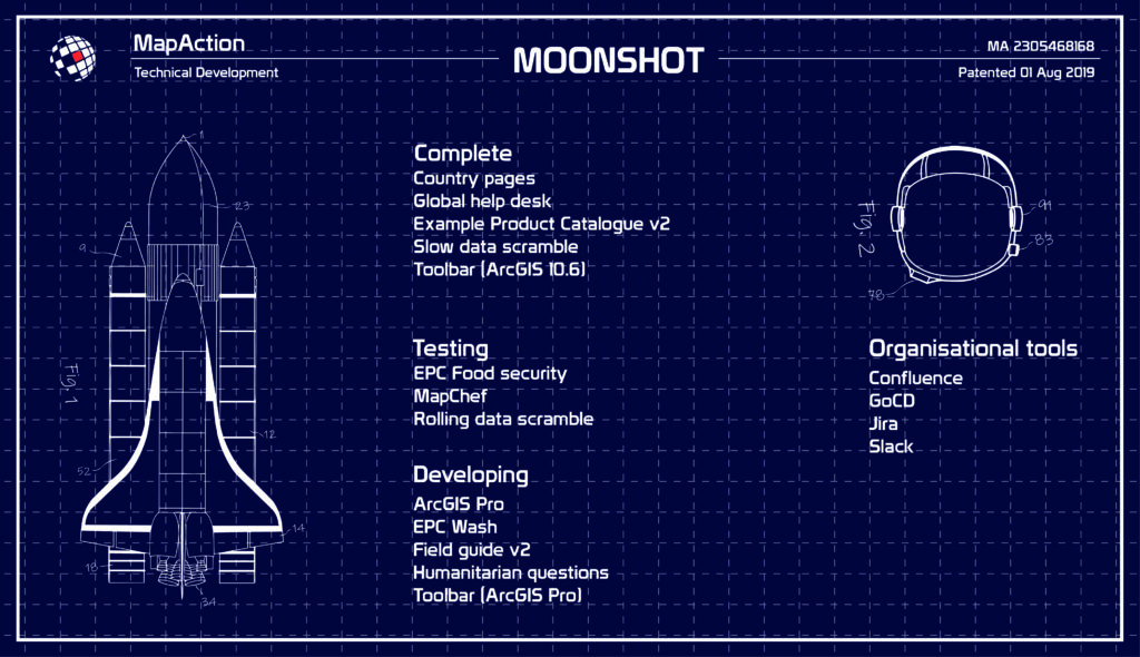
As part of our Moonshot, MapAction is looking to automate the creation of nine core maps that are needed in every response, freeing up vital time for volunteers during an emergency, and, perhaps more importantly, identifying data issues and gaps well before the onset of an emergency. Towards this end, we have just released version 1.1 of our software MapChef, which takes processed data and uses it to automatically create a map. However, even with MapChef up and running, there is still a large gap in our pipeline: how do you get the data in the first place? How do you make sure it’s in the right state to go into the map? And which data do you actually need?
The volunteer team created and led a project intended to answer precisely the above questions, with the goal of scoping out the pipeline. This would include writing the code for completing the above operations, although not yet packaging things together in a smooth way – that is saved for a future pipeline project.
Selecting the right components
The first step was to determine what data is required to produce the core maps. The volunteers identified a list of 23 ingredients that make up these maps, which we call “data requirements”. These range from administrative boundaries to roads, and from airports to hillshading (a technique for creating relief maps). To complicate matters, each data artefact had multiple possible sources. For example, administrative boundaries could come from the Common Operational Datasets (CODs, distributed by the Humanitarian Data Exchange), the Database of Global Administrative Areas (GADM), or geoBoundaries.
“The scale and extent of data available for just a single country administrative area alone is staggering.”
James Wharfe, MapAction volunteer
Next, the team needed to address how to obtain the data and ready it for further processing. Normally, when volunteers make maps by hand, they go to the website associated with each artefact, manually download it, and tweak it by hand until it is ready to be used in a map. However, with the pipeline this all needs to be automated.
To approach this considerable undertaking, the team divided up the work into small, digestible tasks, meeting fortnightly to discuss progress, answer each other’s questions, and assign new tasks. This work continued diligently for seven months, at the end of which they had a functional and documented set of code snippets capable of automatically downloading and transforming the data required for all artefacts.
Overcoming challenges
There were numerous challenges along the way that the team needed to overcome. Understanding the differences between the various data sources proved a significant hurdle. “The scale and extent of data available for just a single country administrative area alone is staggering,” noted volunteer James Wharfe. (Indeed, this data landscape is so complex that it merits its own post – stay tuned for a blog about administrative boundaries as part of our upcoming “Challenges of…” series.)
One particular data source that seemed to crop up everywhere was OpenStreetMap (OSM). Almost all of the data requirements in the slow data scramble are available from OSM, making it a key data source. However, given the sheer detail and size of the OSM database – 1,37 terabytes as of 1 Feb, 2021(source) – there are several difficulties involved when working with the data.
For the download step, the team decided to invoke the Overpass API, and create a Python method to abstract the complex query language down to some simple YAML files with OSM tag lists. Next, the downloaded data needed to be converted from the OSM-specific PBF format to a shapefile, which is the type of data expected by MapChef. Several solutions for this exist: to name a few, Imposm, PyDriosm, Osmosis, OSM Export Tool, and Esy OSM PBF. For this project, we decided to use GDAL, however, we certainly plan on exploring the other options, and hope to eventually host our own planet file.
Code control
Even though the goal of the slow data scramble was not to produce production-quality code, the team still used Git to host their version-controlled code. According to Steve Penson, the volunteer leading the project, “The collaborative and explorative nature of the project meant Git was incredibly useful. With each volunteer tackling significantly different challenges, establishing a strong code control setup made our weekly reviews far easier.”
The team also used the opportunity to extend their Python skills, with a particular focus on GeoPandas, which enables some of the more intricate data transformations that are normally performed by mainstream desktop GIS tools.
Additionally, the group used this work to explore the concept of DAGs, directed acyclical graphs. This term refers to the building blocks of any pipeline: a recipe, or series of steps, that you apply to your data. There are scores of packages available to assist with pipeline development, but to start, the team decided to use a simple workflow management system called Snakemake. Snakemake works by using Makefiles to connect the expected input and output files across multiple pipeline stages. Although, in the end, the team decided it was not the best solution for scaling up to the real pipeline (which is now being developed with Airflow), they agreed that using Snakemake was a great stepping stone to becoming familiar with this key concept.
Working together
Finally, before COVID-19 hit, MapAction’s dedicated volunteers were accustomed to meeting in person once a month – a commitment that led to many enjoyable shared moments and close friendships. This positive and much-loved aspect of being a volunteer at MapAction has unfortunately been hindered by the pandemic. Although still conducted fully remotely, the slow data scramble offered the chance to regularly meet, share expertise, motivate and encourage each other, and work together. Volunteer Dominic Greenslade said it well: “MapAction volunteers are amazing people, and the ability to spend so much time getting to further these friendships was a great bonus”.