By Jorge Andres, MapAction volunteer
A few years ago, on a MapAction team training course, participants were asked to present a map that provided particular insight, analysis, or novelty – going beyond simple descriptive mapping.
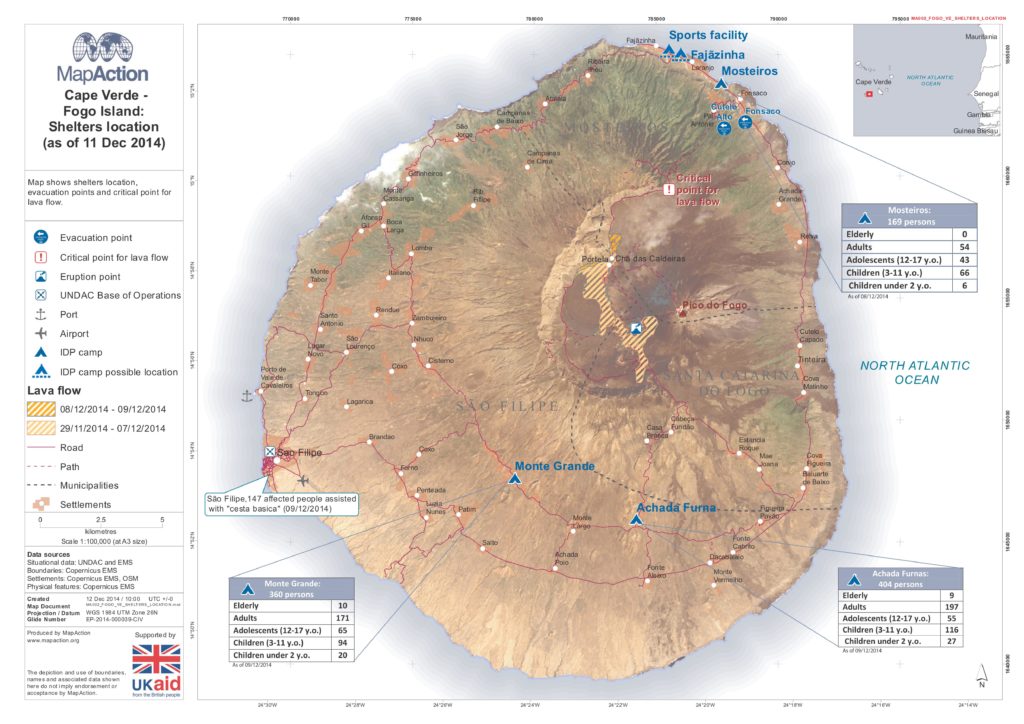
I chose this map I created of the 2014-5 volcanic eruption on Fogo Island. The steep relief of the island was highly relevant for humanitarian response. Emergency coordinators were monitoring the lava flow as it could reach a critical point where some settlements and roads could be potentially affected afterwards. However, trying to show it with contour lines made the map too messy for a shelter map like this. Satellite imagery and some image processing was used. But, with hindsight, I’m not so sure it was the right option.

I thought quite a lot about this map and the visualisation of the relief. But honestly, this was the best I could do on a static map for showing relief to a broad audience without contour lines.
However, creating this map and then later collaborating with the University of Edinburgh on a volcanic hazard mapping project made me think of a 3D output as a better option for maps where relief is extremely important for understanding the emergency situation.
This fed into my approach to creating the below map of the Crisis del Volcán de Fuego in Guatemala last year.
The volcanic hazard mapping project we are collaborating on with Edinburgh University is growing and we now have funding to expand to six more countries. We are currently working on Chile’s Nevados de Chillán.
